
Anvaya case study
Case study: the logo, launch campaign and complete creative system for Anvaya, a premium residential project in Vashi, Navi Mumbai.
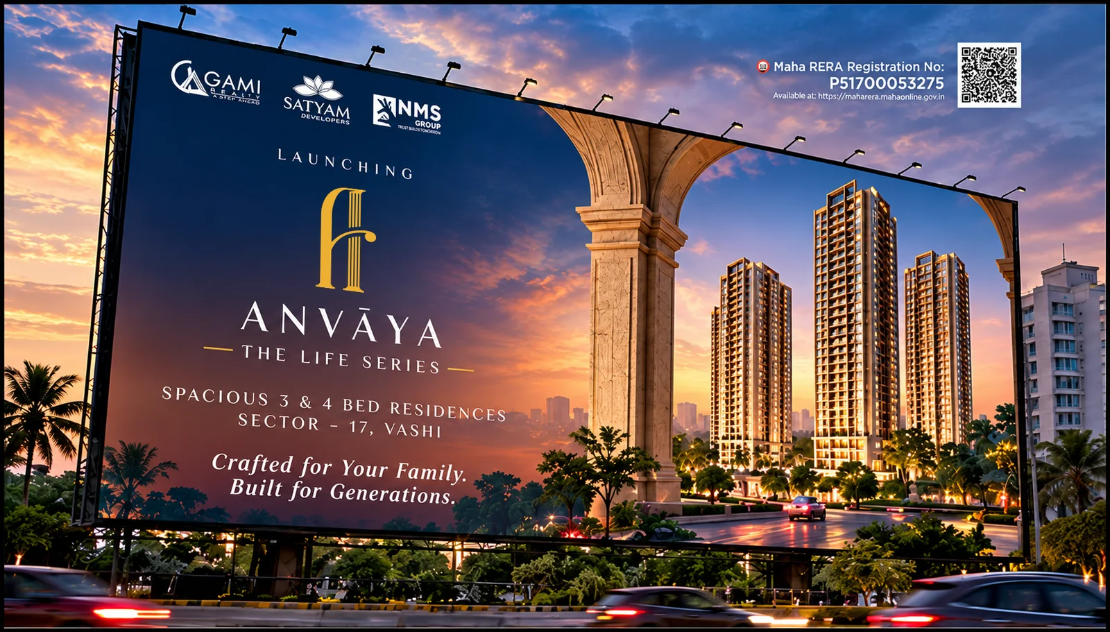
“The Anvaya logo blends classical pillars with modern design, symbolizing strength, elegance and a life built on timeless foundations.
A landmark address, launched with one confident identity
Anvaya, The Life Series, is a premium residential project of spacious 3 and 4 bed residences in Sector 17, Vashi, Navi Mumbai, brought together by three developers: Gami Realty, Satyam Developers and NMS Group. The Shades created the brand and the complete project creative, from the first logo sketch to the billboard on the road.
Our job was to make one address feel rooted in the neighbourhood and still unmistakably premium, and to keep every touchpoint consistent: hoardings, social media, brochure, presentation, website and digital banners.
- Brand strategy and positioning
- Logo and project identity
- Teaser and reveal campaign
- Site hoardings and billboards
- Social media creatives
- Brochure and opportunity presentation
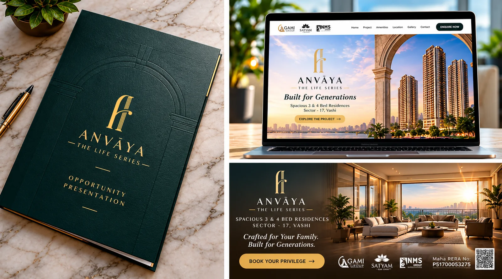
- Website design
- Digital ad banners
A new address in a neighbourhood that rarely gets one
Sector 17, Vashi had not seen a new residential address in over thirty years. Buyers here know the area well, so the project had to feel familiar and aspirational at the same time.
It also had to bring three developers together under one clear identity, and work equally well on a ten metre hoarding and a phone screen.
Timeless, warm and generous with space
We built a classical but modern brand: a pillar-inspired monogram, a refined serif wordmark and a palette of deep green, ivory and gold. Generous space in the layouts mirrors the generous space in the homes.
Campaign lines such as Crafted for your family. Built for generations. keep the tone human, premium and easy to remember.
Three ideas behind the Anvaya brand
Legacy
Classical pillars and a timeless serif wordmark signal strength and a life built on strong foundations.
Space
Light, air and generous layouts are the promise of the residences, so every creative leaves room to breathe.
Community
A neighbourhood reborn with over 25 amenities, retail and gardens, designed as a destination of its own.
A monogram built on classical pillars
The Anvaya symbol turns a pillar and an arch into a single elegant monogram. The wordmark uses wide-spaced capitals with a macron on the first A, and the tagline The Life Series sits between two fine lines, which gives the logo a calm, premium rhythm.
The mark works in gold on deep green, in dark green on ivory and in white on blue, so it stays recognisable on a printed folder, an embossed cover and a billboard at night. The same identity extends to the opportunity presentation, the website header and the digital banners.
A brochure that reads like a lifestyle magazine
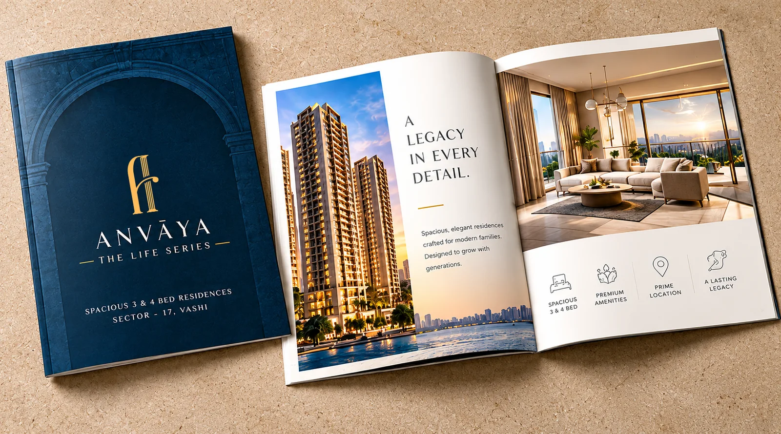
The brochure pairs a deep blue embossed cover with an ivory inside spread. A large tower photograph on one page and a sunlit living room on the other, with the line "A legacy in every detail", set the mood before any floor plan appears.
A row of simple line icons for spacious 3 and 4 bed homes, premium amenities, prime location and a lasting legacy makes the key benefits easy to scan.
A site barricade that works as a brand wall
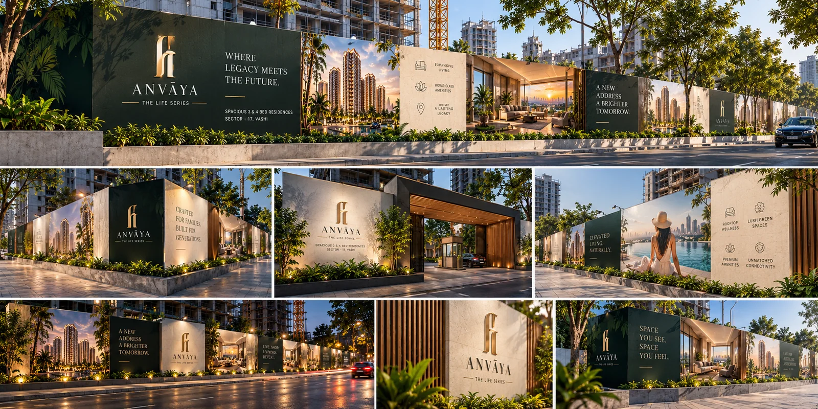
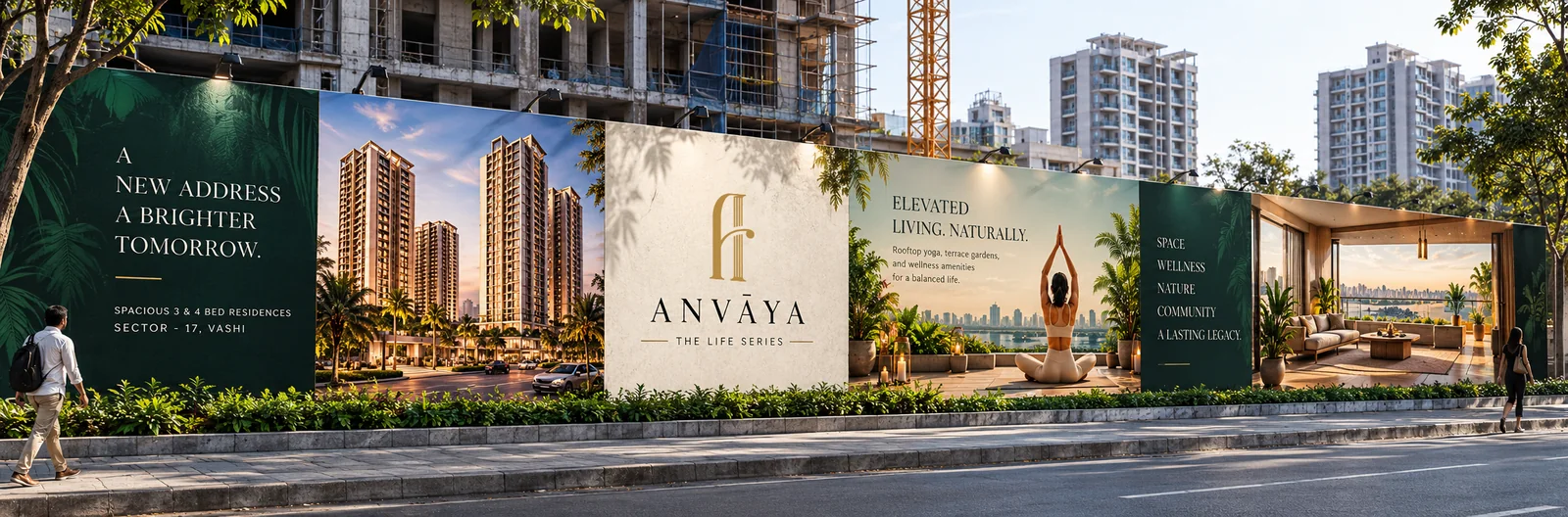
Construction sites are the first thing people see in a neighbourhood. We designed the site hoardings as a continuous brand wall: dark green panels with large headlines, ivory panels with the logo and amenity icons, and photographic panels showing the towers and the lifestyle.
Headlines like "Where legacy meets the future", "A new address, a brighter tomorrow" and "Elevated living, naturally" read from a moving car, while the logo, location and developer names stay clear on every module. The same system scales to a large road-side billboard with RERA details and a QR code.
A campaign that builds curiosity first
Before the name was revealed, the teaser series asked questions that people in Vashi would stop for: "When a door opens after decades, who will step in?", "How many stories can one home hold?" and "Some opportunities speak softly. To those who listen."
The reveal series then answered with the project, the location and clear benefits: sunlit decks, panoramic views, private walk-in wardrobes in every 4 bed residence, a pooja room and more than 25 amenities. Every creative closes with the same promise, Crafted for your family. Built for generations.
A feed made for Facebook, Instagram, stories and reels
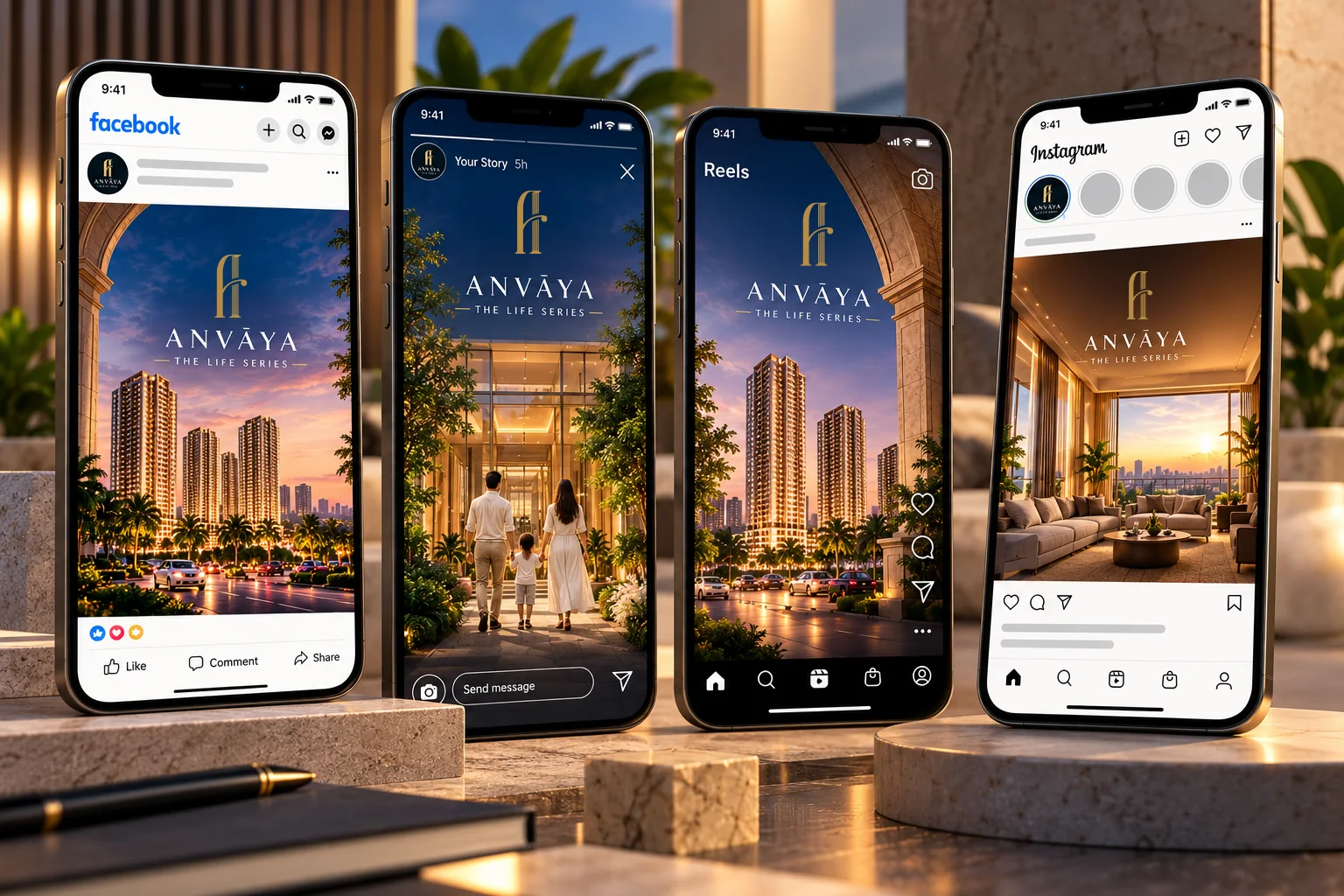
The social creatives use the same tower imagery, gold logo and calm serif typography so that a story, a reel cover and a feed post all look like one campaign. Vertical layouts keep the logo and the headline inside the safe area on a phone.
We also designed the profile images, highlight covers and ad formats, so the brand looks complete from the first announcement.
One identity from site hoarding to phone screen
Anvaya now has a complete, consistent identity that works on a billboard, in a brochure, on a website and in a story. The developers had a single clear voice for the launch, and the neighbourhood had a single clear face for its new address.
This is the same approach we bring to every real estate project: a distinctive logo, a campaign idea that people remember and a system that keeps every touchpoint consistent.
Related services: real estate advertising, brand identity design, logo design and website design.
Questions about this project
What did The Shades create for Anvaya?
Do you design real estate branding and launch campaigns in Navi Mumbai?
Can you handle a project with more than one developer?
What is a teaser campaign in real estate?
Want a brand story like Anvaya?
Tell us what you are building. We reply the same working day with ideas, a timeline and a clear quote.