
Gélique case study
Case study: bringing a refrigerated collagen jelly to India with a logo that moves like the product, a two-flavour packaging system and a seven-page website.
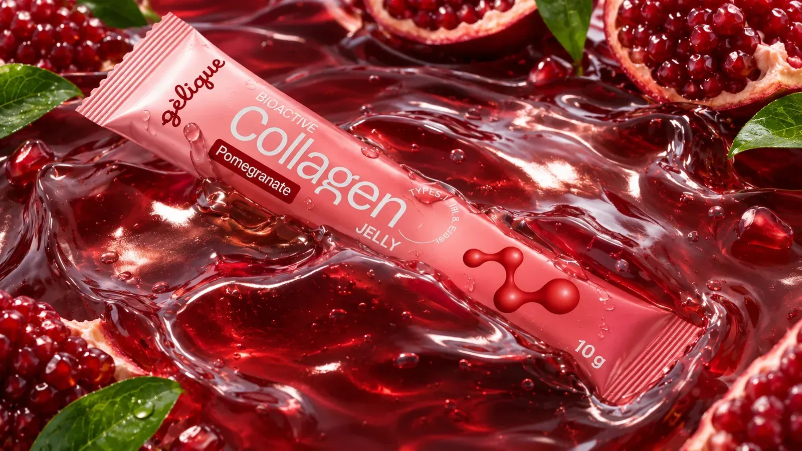
A collagen brand that feels like skincare
Gélique is a new bioactive collagen jelly for India: a 10 g stick, kept at 2 to 8 °C, made with cold-extracted Type I, II and III collagen and Elastin. Tear it, squeeze it straight in, done. No water, no mixing.
The Shades built the brand from the logo up: the name, a script wordmark that behaves like jelly, a colour and type system, the packaging for two flavours, campaign imagery and the website. Everything follows one idea, so the brand looks the same on a fridge shelf, a vanity and a phone screen.
- Name and brand idea
- Script logo
- Colour and typography
- Two-flavour packaging
- Campaign imagery
- Seven-page website
“Bring a refrigerated collagen jelly to a shelf full of powders, and make it feel like a beauty product rather than a supplement.
A category where everything looks the same
Collagen in India is mostly sold as heat-processed powder in clinical tubs. The look borrows from pharmacy shelves and talks mostly to the gym. Gélique is a chilled jelly in a slim stick, so it had to be recognisable in a fridge door and still earn trust with a lot of science behind it.
Premium, warm and young
We aimed for an identity that sits next to serums on a vanity, reads instantly on a stick 2 cm wide and carries enough proof to be believed. Warm red instead of clinical white, a handwritten wordmark instead of a sharp logo, and glossy fruit photography instead of stock supplement imagery.
We built one connected system first, then applied it to the packaging, the imagery and the website.
Three questions the brand had to answer
The product
A 10 g jelly stick kept at 2 to 8 °C. Cold-extracted Type I, II and III collagen with Elastin, squeezed straight from the stick.
The problem
A category that all looks the same: heat-processed powders, clinical tubs and a look made for the gym.
The goal
Premium, warm and young. An identity for a vanity, easy to read on a slim stick and credible enough for a health product.
Gélique = gel + -ique
The name joins the product’s form with a beauty cue. gel says jelly before anyone reads the label, and -ique sounds at home in skincare. It is short to say (jel-eek), easy to spell, and the accent on the è became a design element of its own.
A wordmark written the way jelly leaves the stick
The logo is one continuous, even line with soft rounded ends. It started as pencil loops in a sketchbook: squeeze a stick and the line loops by itself, with no corners and no lifts. We tested three script directions before choosing a monoline jelly script. The others read as candy, a retro diner or too thin, so the jelly disappeared.
One continuous line
All seven letters connect without a lift, so the mark reads as one squeeze of jelly from the stick.
Even, soft weight
A monoline stroke with fully rounded ends. Nothing sharp and nothing thin, so it stays legible on a 2 cm wide sachet.
The droplet accent
The accent on the è is drawn as a drop. It gives the name its French lilt and works as a small brand signature.
One warm red, porcelain neutrals and a fruit colour per flavour
One warm red carries the brand. Porcelain neutrals keep it calm, and each flavour brings its own fruit colour. There is no black anywhere in the system, which is part of why it feels like beauty and not like a supplement.
Logo, buttons, gradients
Base
Surfaces
Text
Flavour
Flavour
Hero and buttons
A wide, confident headline face
Hagrid for headlines and numbers: wide and confident, so the brand has presence next to the delicate script logo.
A precise grotesk for everything else
Space Grotesk for body copy, labels, forms and data. Together the two read as modern skincare with a lab behind it.
A slim stick with one job: be recognisable in a fridge door
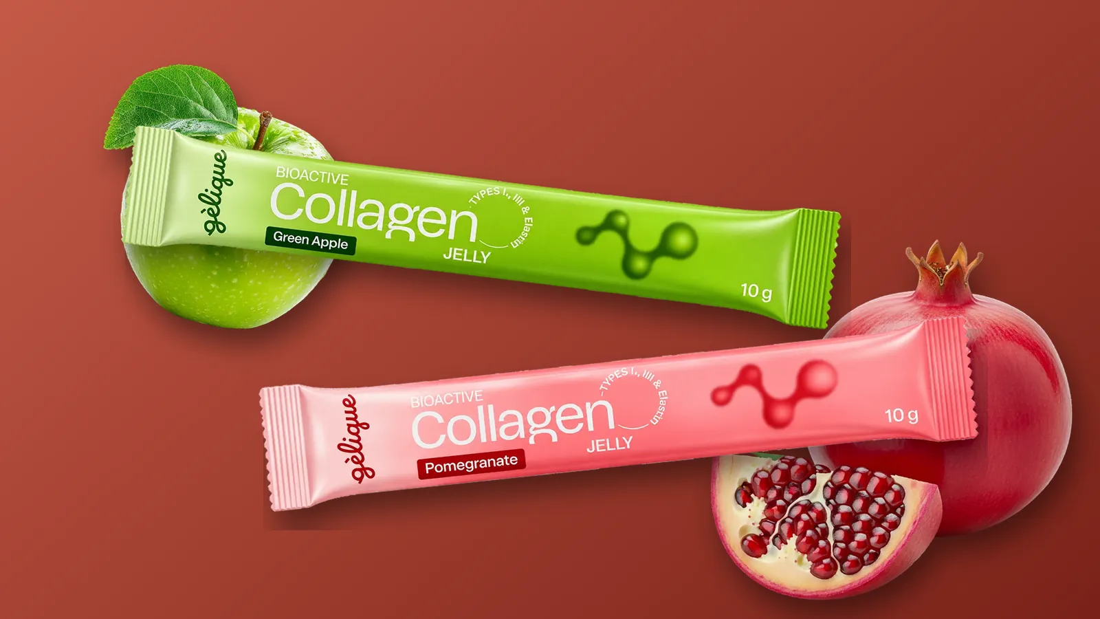
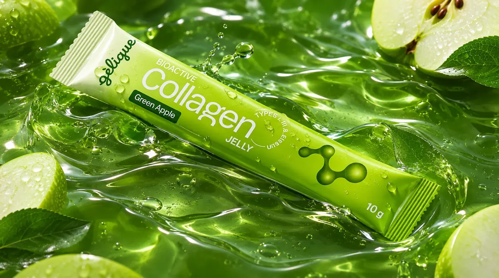
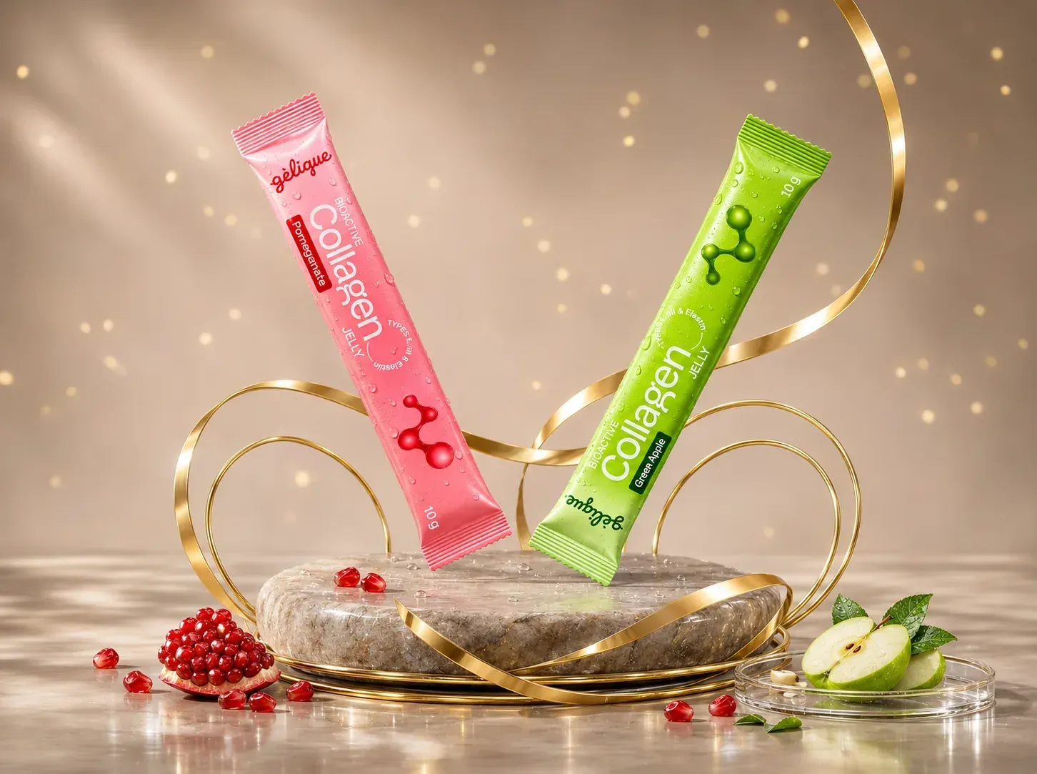
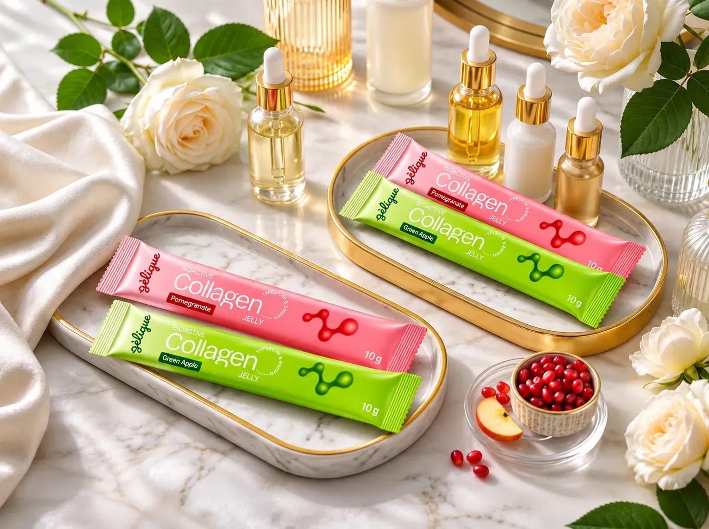
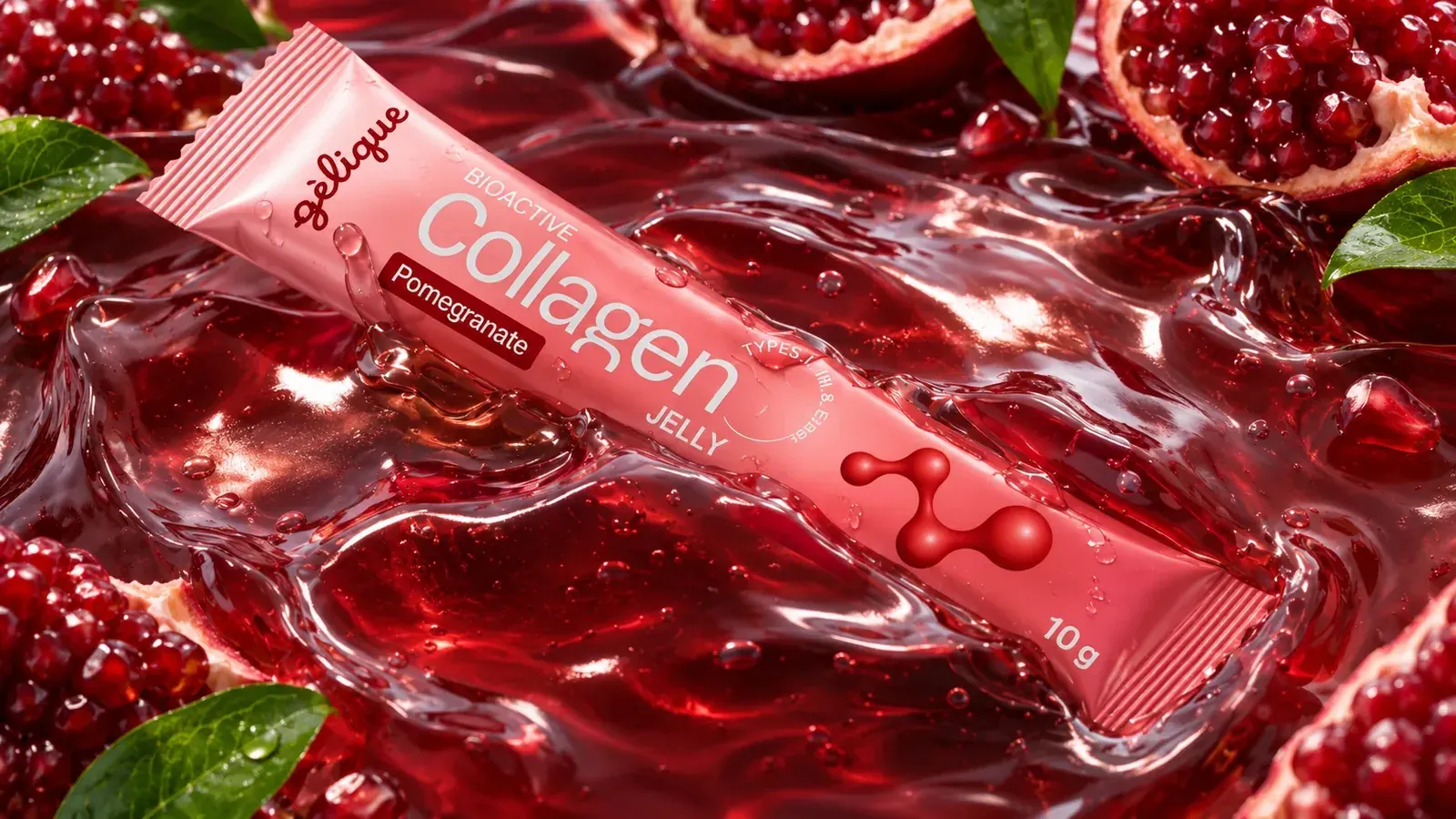
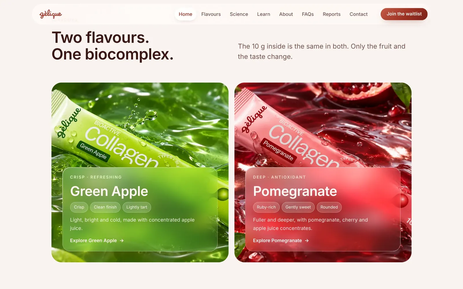
The logo runs up the crimp, the molecule floats at the far end of the stick, and colour does the flavour work. Green Apple and Pomegranate each get their own fruit colour, while the layout, type and molecule stay identical, so the two flavours read as one family. The glossy collagen molecule printed on the stick became the brand motif, and on the website it turns into soft red light behind frosted glass.
The ritual, explained without reading
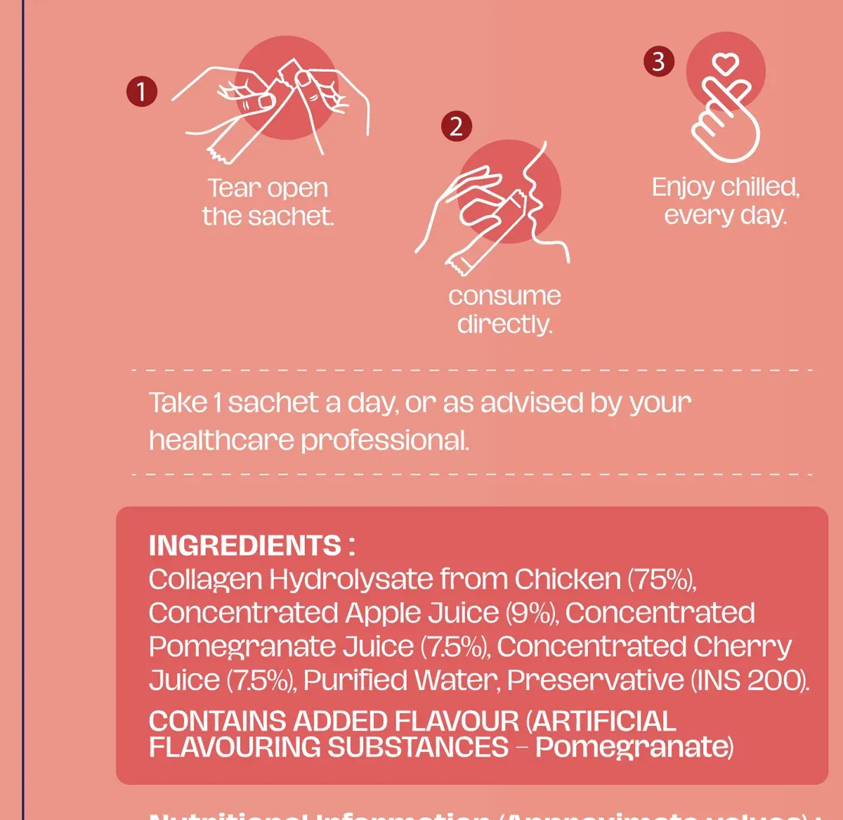
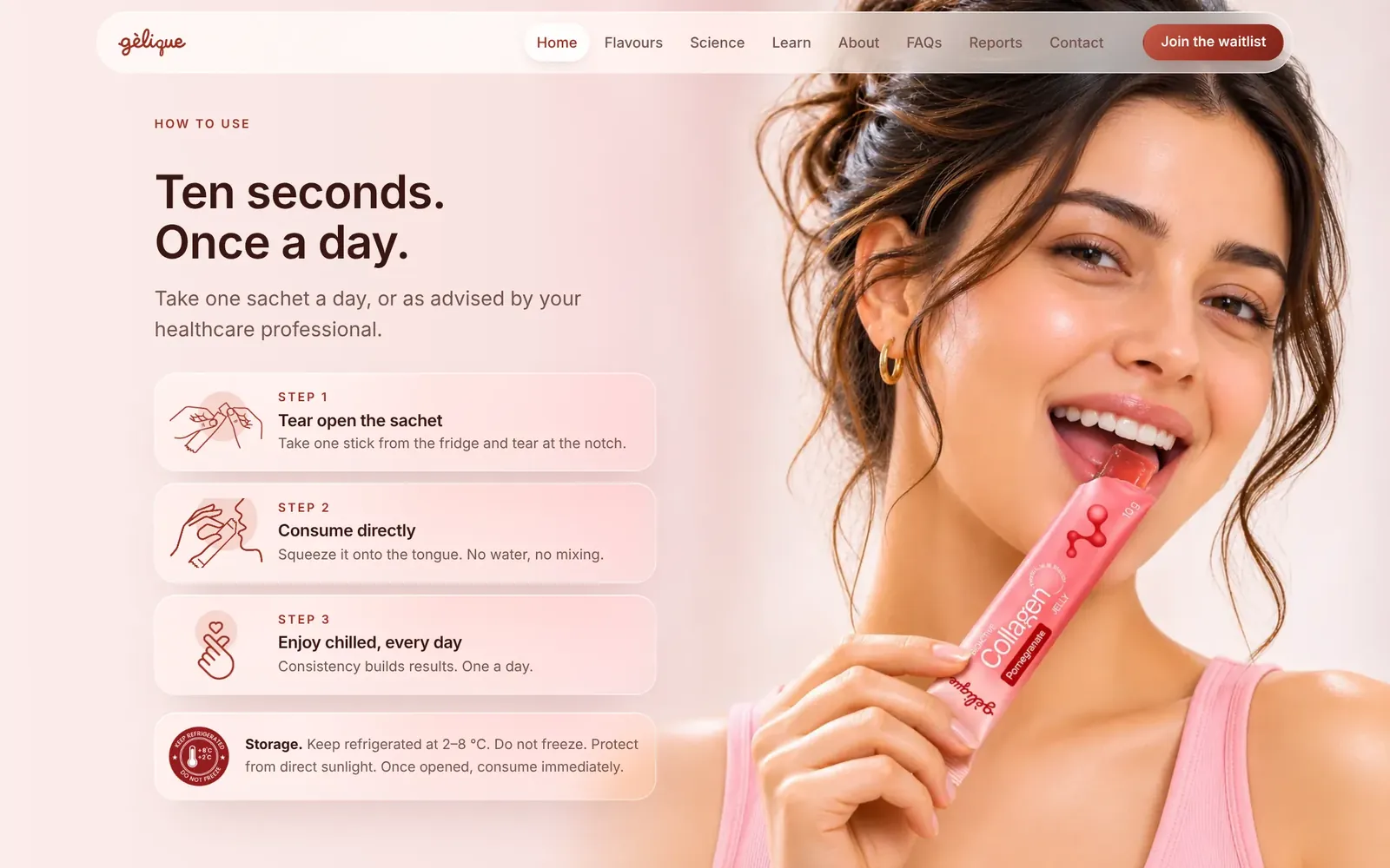
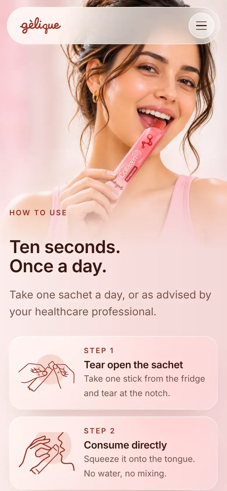
The back of the box uses simple line illustrations so the steps are clear at a glance, next to the ingredients and nutrition table. The same drawings return on the website in brand red.
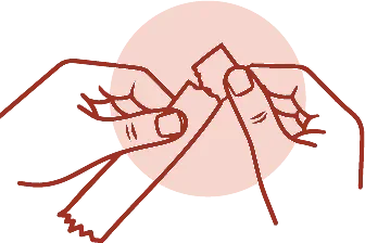 Tear open
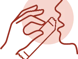 Consume directly
 Enjoy chilled
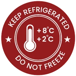 Keep 2 to 8 °C
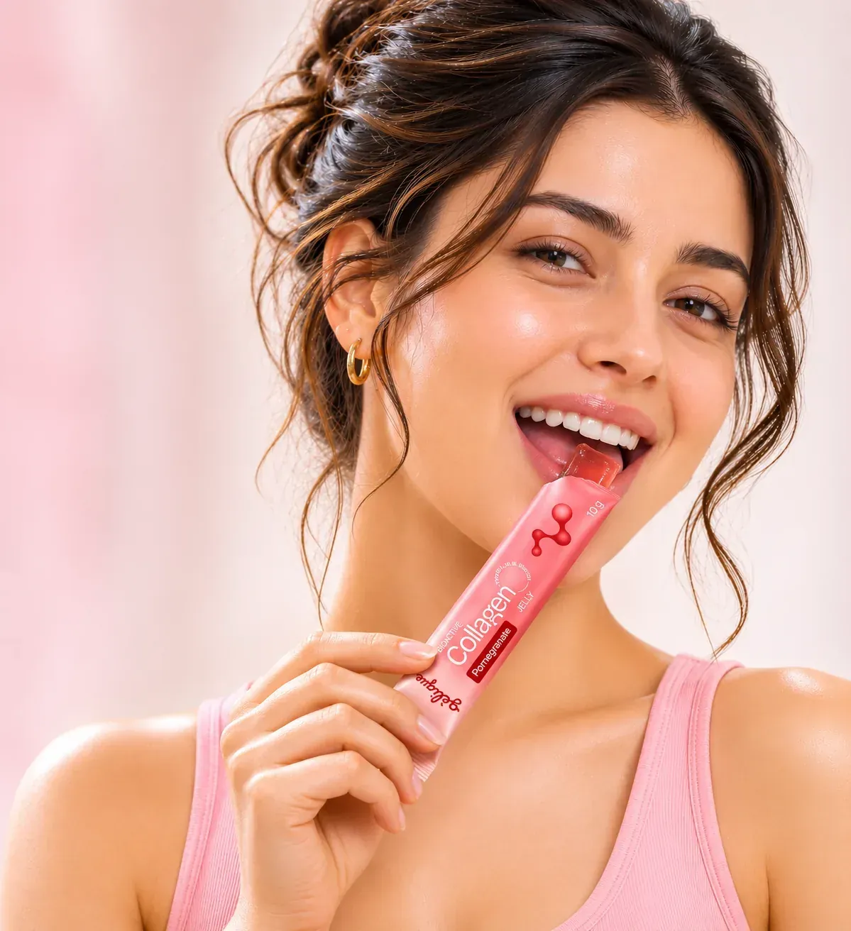
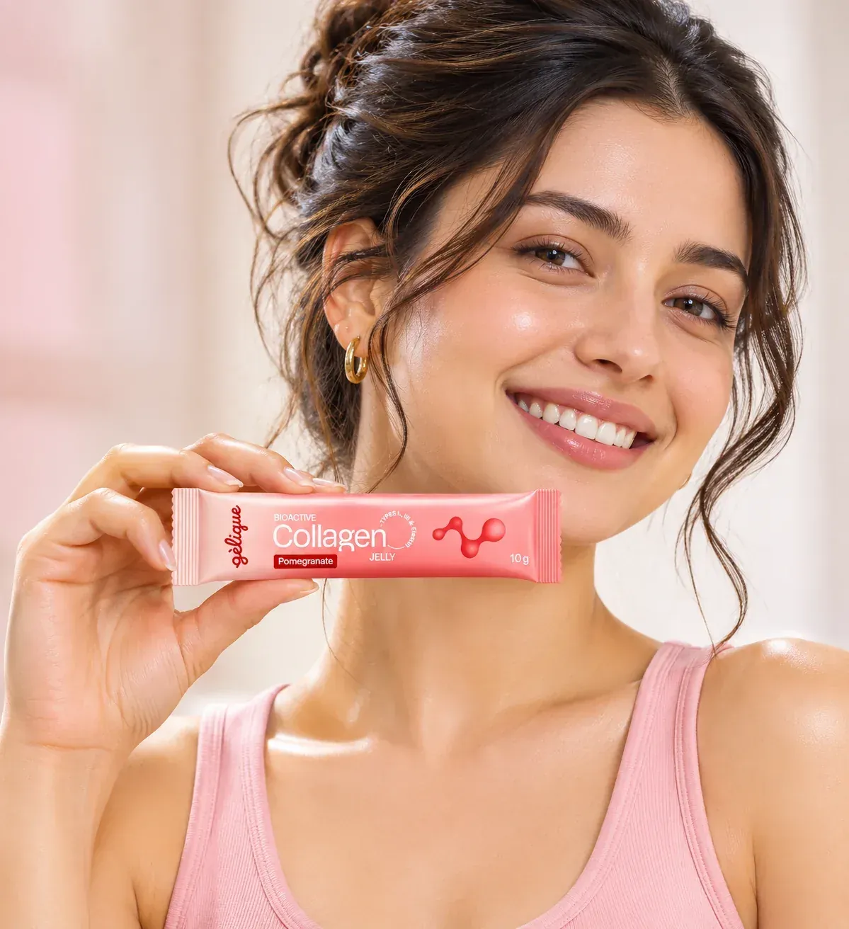
Wet, glossy and close up
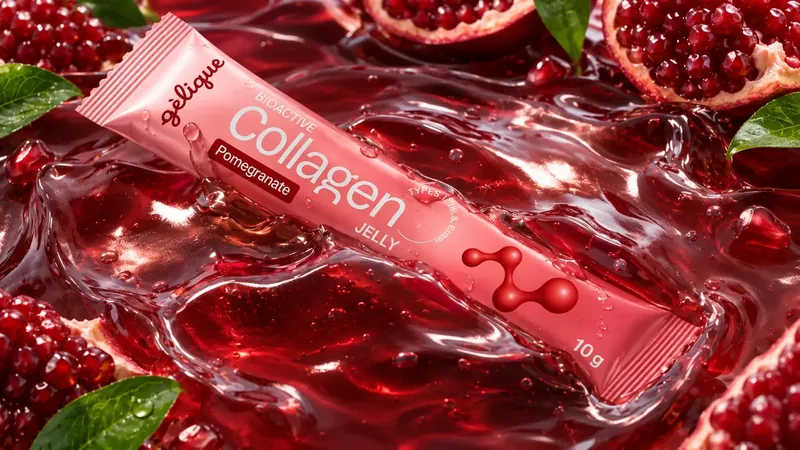
Each flavour gets its own jelly world, and the people shots show the ten-second ritual as something you enjoy. On the vanity, the sticks sit next to serums, which is exactly the shelf the brand wanted to belong to.
Seven pages that sell the ritual and prove the science
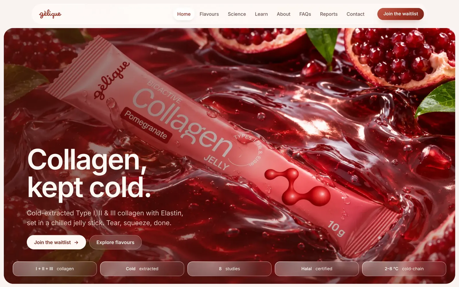
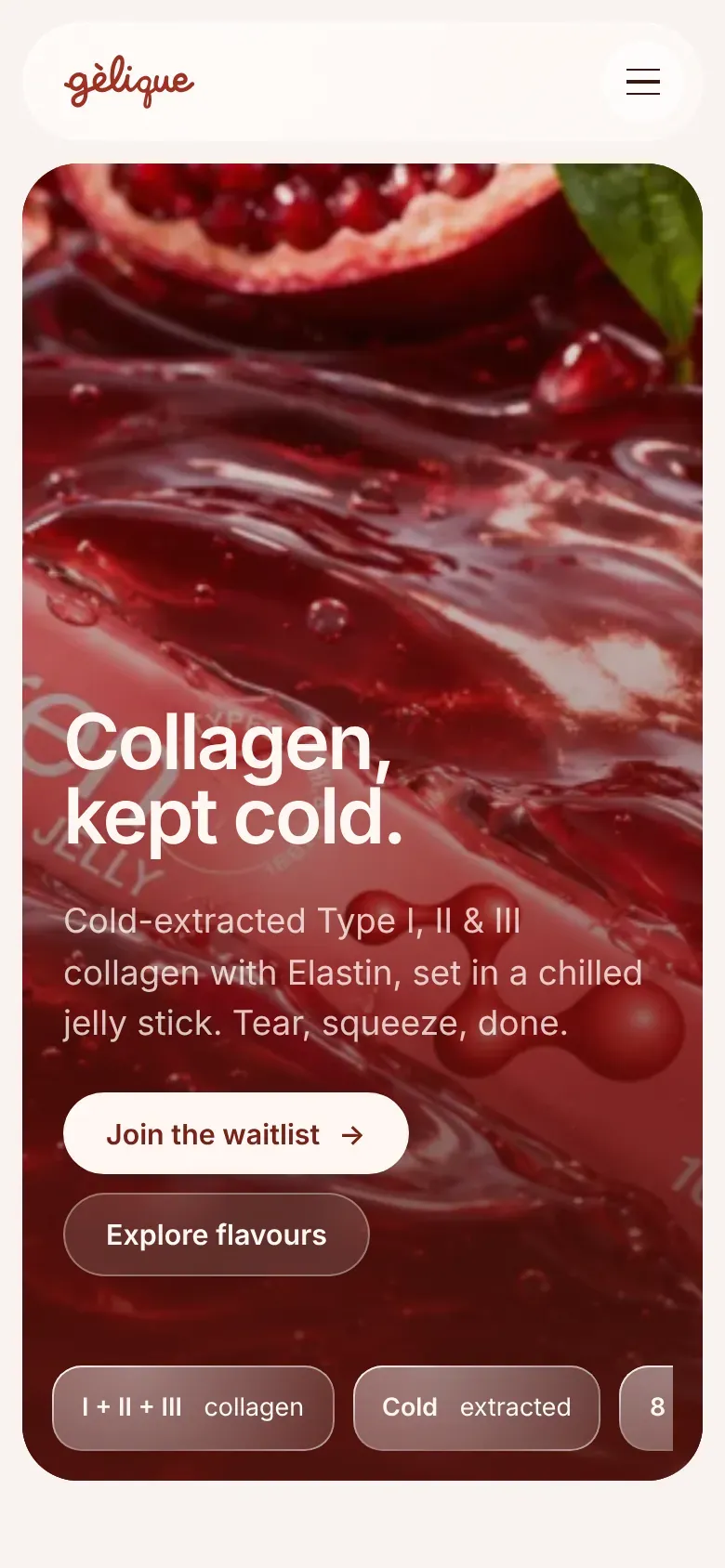
Flavours, the extraction story, a collagen guide, independent lab reports and a waitlist. The site uses the frosted-glass interface over drifting molecule shapes, with motion kept restrained: letter-by-letter headline reveals, image curtains and a page-turn between pages.
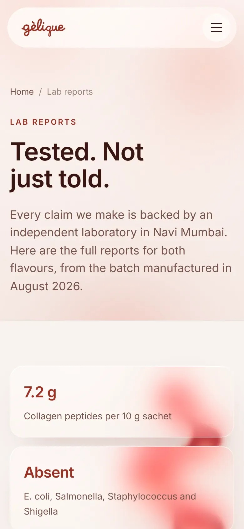
Built to convert, easy to run
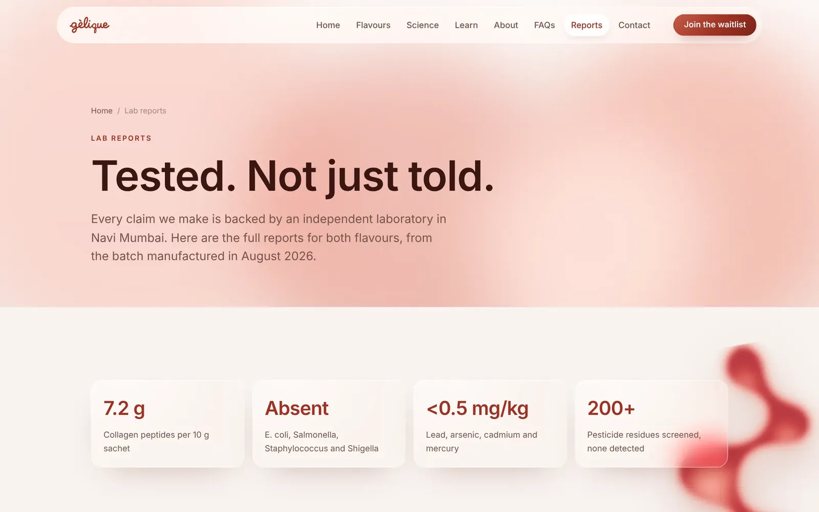
Lab reports, in full
Fourteen independent test reports, split by flavour, with the headline results up front.
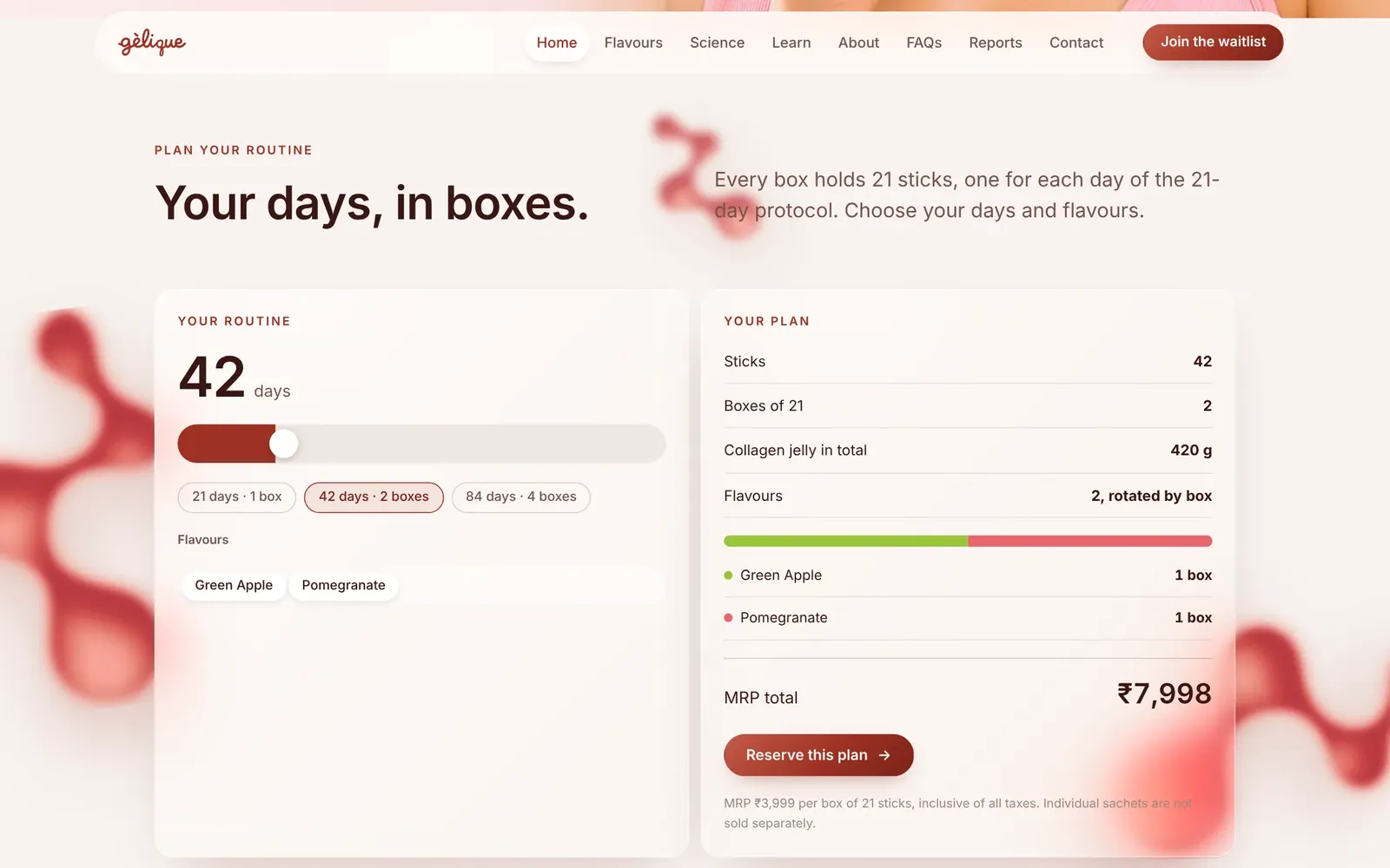
Routine planner
Pick days and flavours, and the page works out sticks, boxes and the total.
Search ready
Per-page titles and descriptions, product, FAQ and breadcrumb schema, a sitemap and a collagen guide for long-tail search.
Five rounds, each one removing something
The website went through five rounds with the client. Each round took something away until only the brand was left.
- 01
Night and 3D
A dark stage with a 360° rotating sachet. Striking, but too heavy for a beauty brand.
- 02
Rose jelly
One rose hue and playful jelly motion. Fun, but it read young in the wrong way.
- 03
Sober multipage
Seven calm pages, real content and correct image crops. The foundation.
- 04
Creative motion
A hero banner, bento grid, planner and text reveals on top of that foundation.
- 05
Liquid glass
Frosted glass, the molecule motif, two flavours and the lab reports. What shipped.
One brand, from the stick to the screen
From the first pencil loop to the lab reports page, Gélique now looks like one confident, warm brand. The script logo, the red, the molecule, the glossy photography and the frosted glass all belong together, so a customer who sees the stick, the box or the site immediately knows they are the same product.
This is how we work at The Shades: we do not just design a logo and hand it over. We build the whole brand system and extend it to the formats that matter for sales.
Related services: brand identity and logo design, product packaging design, website design and branding for personal care and cosmetics. See the live site: gelique.com.
Questions about this project
What did The Shades create for Gélique?
How did you design the Gélique logo?
Can you design packaging for a beauty or wellness supplement?
Do you design the website as well as the brand?
Want a brand story like Gélique?
Tell us what you are building. We reply the same working day with ideas, a timeline and a clear quote.