
Shipter case study
Case study: a reliable, fast and friendly brand identity for an on-demand delivery startup.
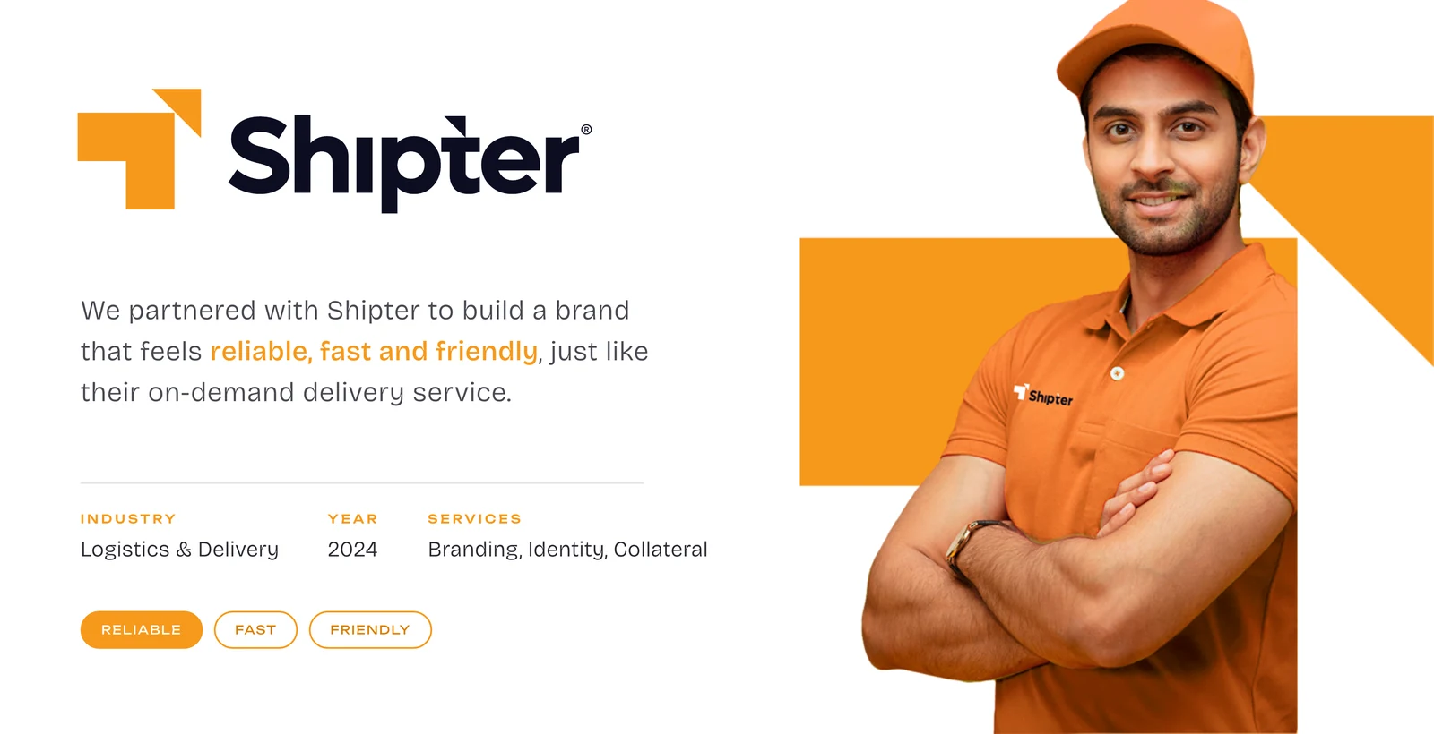
“We partnered with Shipter to build a brand that feels reliable, fast and friendly, just like their on-demand delivery service.
A delivery brand that feels reliable, fast and friendly
Shipter is an on-demand delivery service in the logistics and delivery sector. We partnered with the team in 2024 to build a brand that feels reliable, fast and friendly, just like the service itself.
The project covered branding, identity and collateral, from the logo to vehicles, uniforms, packaging and social media.
Standing out where trust matters
Shipter entered a competitive market where trust, speed and safety are key. The challenge was to create a brand that stands out with simplicity, clarity and a strong sense of care.
Bold, minimal and in motion
We built a bold and minimal identity that communicates movement and reliability. The visual language is friendly, modern and instantly recognisable across every touchpoint.
Reliable. Fast. Friendly.
Reliable
A solid, simple symbol and deep blue tones show safety and care for every parcel.
Fast
A forward arrow, a bright orange and a heavy wordmark communicate speed and movement.
Friendly
Warm colours, rounded details and a local, playful voice keep the brand approachable.
A complete identity, built to scale
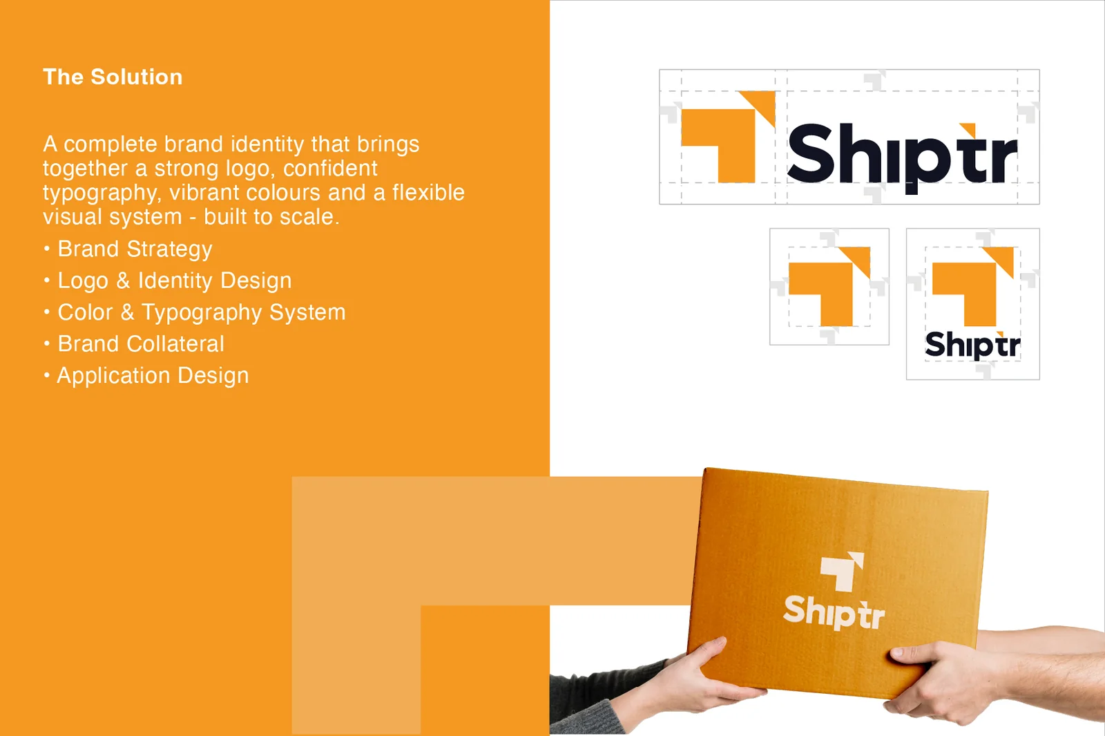
The Shipter symbol uses an arrow-like shape that suggests direction, delivery and a parcel moving forward. The wordmark is set in a heavy, friendly typeface with a small arrow detail on the letters, so the name itself feels like it is in motion.
We created a primary logo, a standalone symbol and a stacked version, each with clear space rules, so the brand stays consistent on a truck, an app icon or a cardboard box. The symbol reads clearly even at very small sizes, which matters for caps, uniforms and app icons.
- Brand strategy
- Logo and identity design
- Colour and typography system
- Brand collateral
- Application design
Warm orange with deep blue
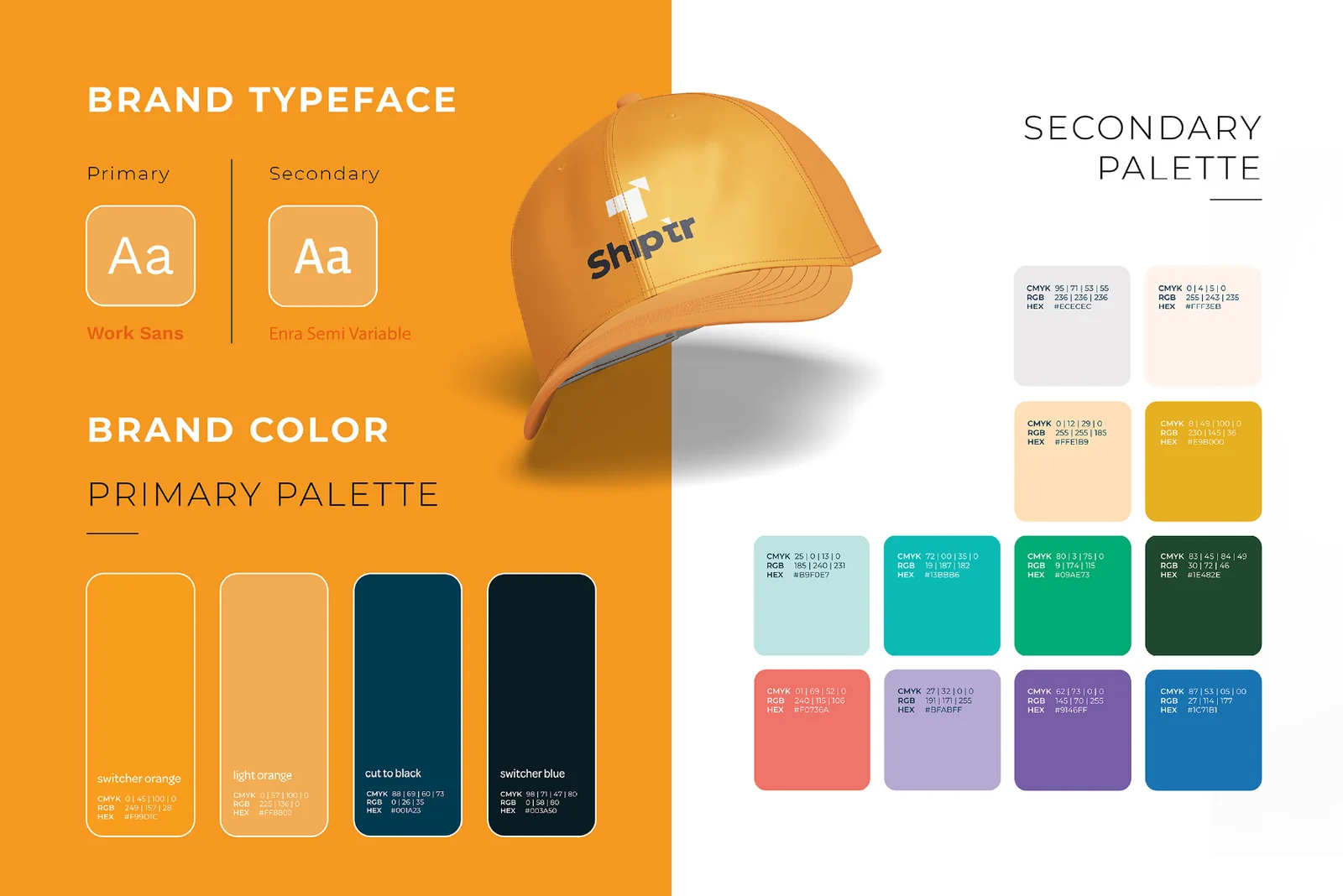
A vivid orange (Switcher Orange) gives Shipter energy and visibility, while deep blue tones (Cut to Black and Switcher Blue) add trust and stability. A secondary palette of soft neutrals, teal, green, coral and purple supports campaigns and app screens.
The brand typeface pairing uses Work Sans as the primary font and Enra Semi Variable as the secondary font, clean, modern and easy to read on screens and in print.
From the delivery van to Instagram
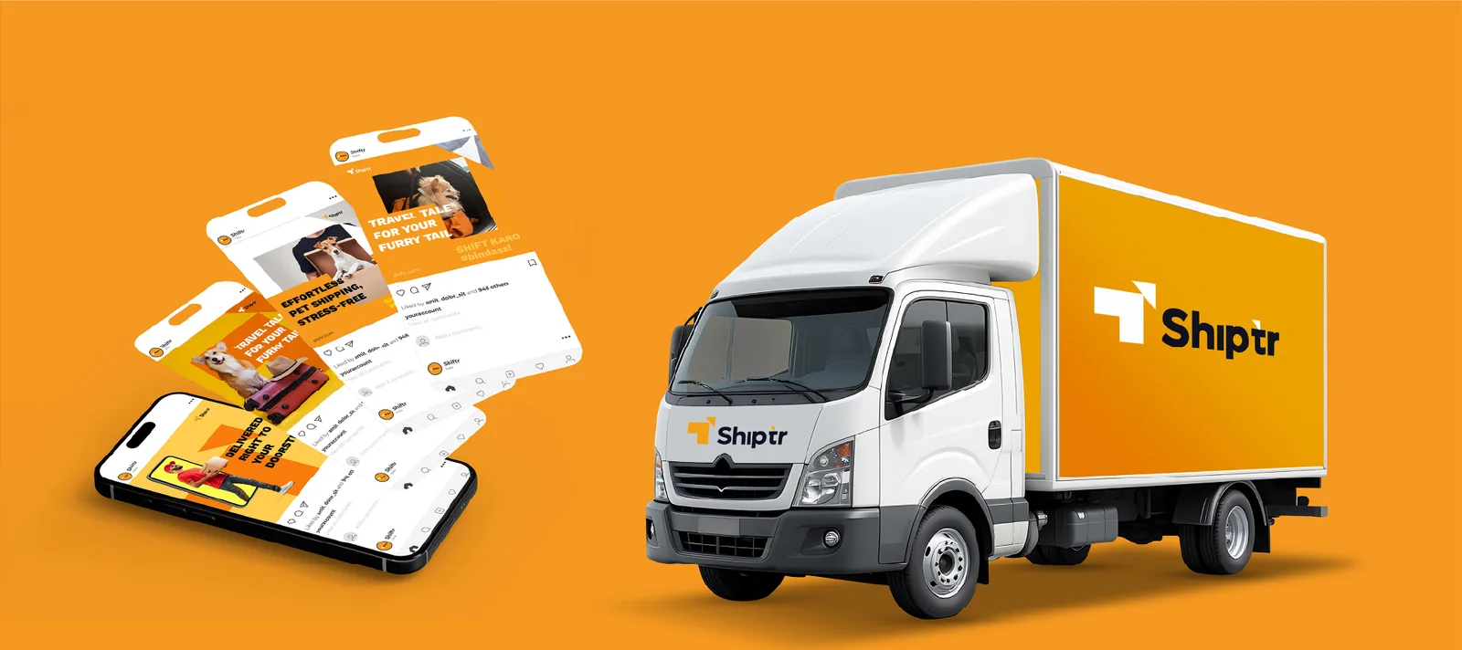
The identity was applied across the places customers actually meet the brand: delivery vehicles, uniforms and caps, shipping boxes and social media. A bright orange body with a white logo makes every vehicle easy to spot on the road.
For social media we designed templates for travel, pet shipping and doorstep delivery stories with friendly, local-feeling headlines such as "Shift karo, #bindass", so the brand feels approachable.
A brand that is easy to recognise and easy to apply
Shipter now has a complete identity that works on a delivery van, a cap, a cardboard box and a social media post. The simple symbol, the warm orange and the friendly wordmark make the brand recognisable at a glance, while the clear guidelines keep every new application consistent.
For a logistics startup, that consistency builds trust. Customers see the same reliable look on the vehicle that arrives, the parcel they receive and the posts they follow online.
Related services: brand identity design, logo design and packaging design.
Questions about this project
What did The Shades create for Shipter?
Do you design brands for startups and logistics companies?
How long does a startup branding project take?
Can you also design the website and social media for a new brand?
Want a brand story like Shipter?
Tell us what you are building. We reply the same working day with ideas, a timeline and a clear quote.