
Power Peak case study
Case study: building a bold, performance-driven collagen brand with a premium visual identity.
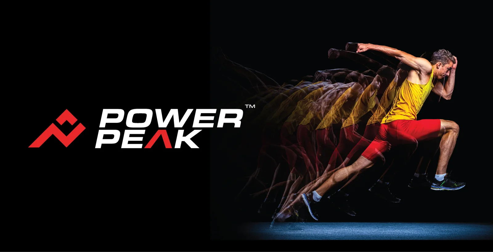
A collagen brand built for performance
Power Peak is a bold, performance-driven hydrolyzed collagen brand for athletes, gym-goers and anyone who wants stronger joints, skin and faster recovery. The Shades handled the complete visual journey: brand identity, packaging, website and social media design.
The design system combines a strong athletic aesthetic with a clean, premium visual language, so the brand looks credible on a shelf, on a phone screen and on a marketplace listing.
- Brand strategy and positioning
- Logo and brand identity
- Stationery and brand collateral
- Flavour-wise product packaging
- Website design
- Social media design
- Amazon listing creatives
“PowerPeak was developed as a bold, performance-driven collagen brand, with The Shades handling the complete visual journey, from brand identity and packaging to website and social media design. The design system combines a strong athletic aesthetic with a clean, premium visual language to create a consistent and recognisable brand across every touchpoint.
Entering a crowded supplement market
Collagen and nutrition supplements are everywhere, and most of them look alike: pastel pouches, vague wellness language and generic stock photos. Power Peak needed to be taken seriously by athletes and gym-goers, but also feel premium enough for people who simply want healthier joints, skin and faster recovery.
It also had to work across very different places: a physical jar on a shelf, a small thumbnail on Amazon, an Instagram grid and a full website.
Athletic energy with premium restraint
We started with the name and the idea behind it. Power Peak became a brand about power and summit, and every decision followed from that: a sharp geometric symbol, a forward-leaning wordmark, a black and red palette and a confident, motivational tone of voice.
Instead of designing each piece alone, we built one connected design system first, then applied it to the packaging, website, social media and marketplace creatives.
Three ideas behind every Power Peak design
Power
Energy, strength and drive, shown through a sharp symbol, heavy italic type and a bold red accent.
Peak
The summit every athlete is chasing, built into the mountain shape of the logo and the confident tone of voice.
Premium
A clean black and white base, careful spacing and realistic product renders keep the brand credible and trustworthy.
A lightning bolt meets a mountain peak
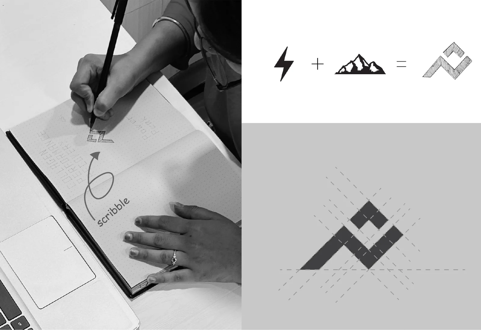
The idea behind the Power Peak logo is simple: energy + summit = performance. A lightning bolt represents power, a mountain represents the peak every athlete is chasing, and together they form one geometric symbol.
We started with pencil sketches, built the mark on a precise construction grid and refined it until it worked at every size, from a small social profile picture to a large printed jar.
A sharp logo with a confident red and black palette
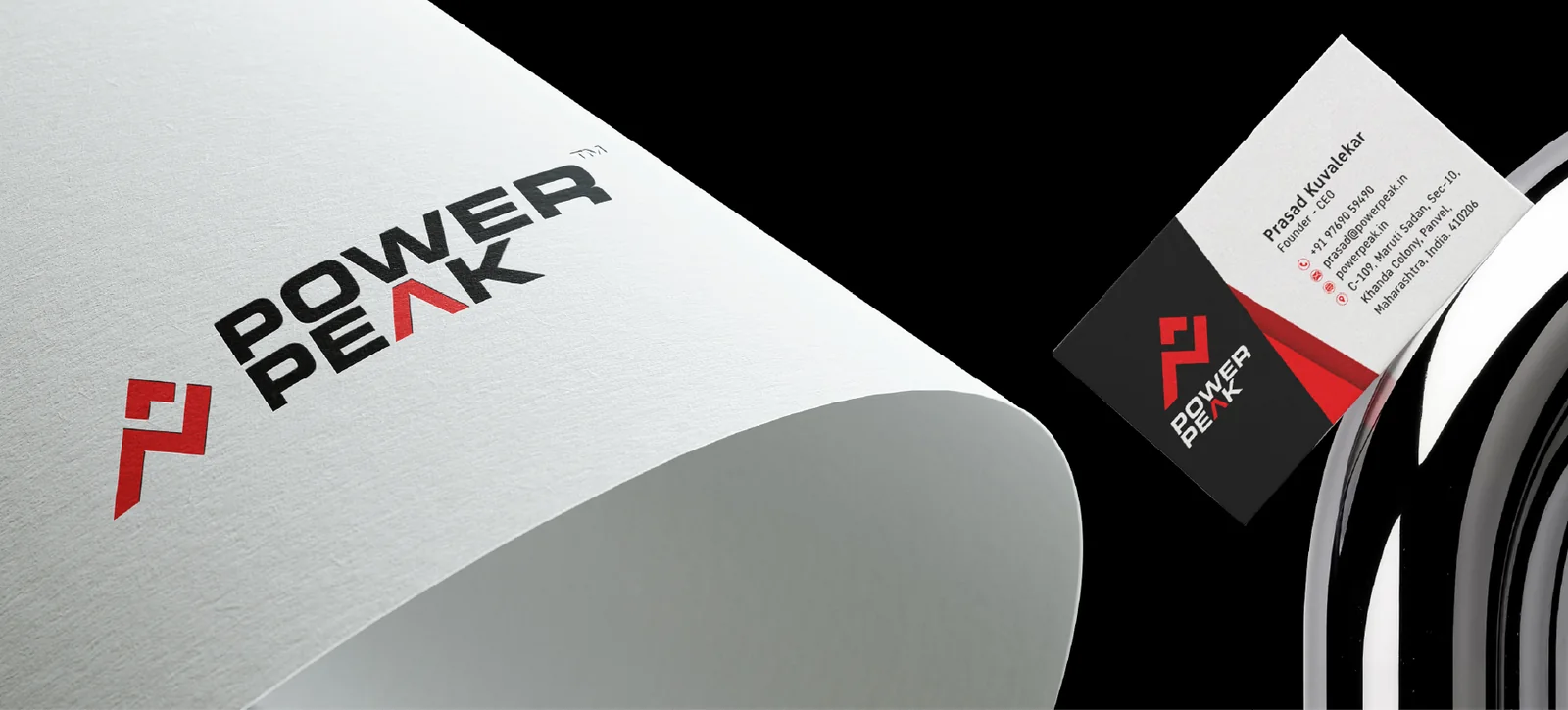
The finished logo pairs the symbol with a bold, forward-leaning wordmark and a red accent on the peak of the letter A. Red brings energy and urgency, while black and white keep the brand premium and easy to read.
The identity extends to business cards, letterheads and other stationery, so every first impression with the brand feels consistent.
One packaging system, four flavours
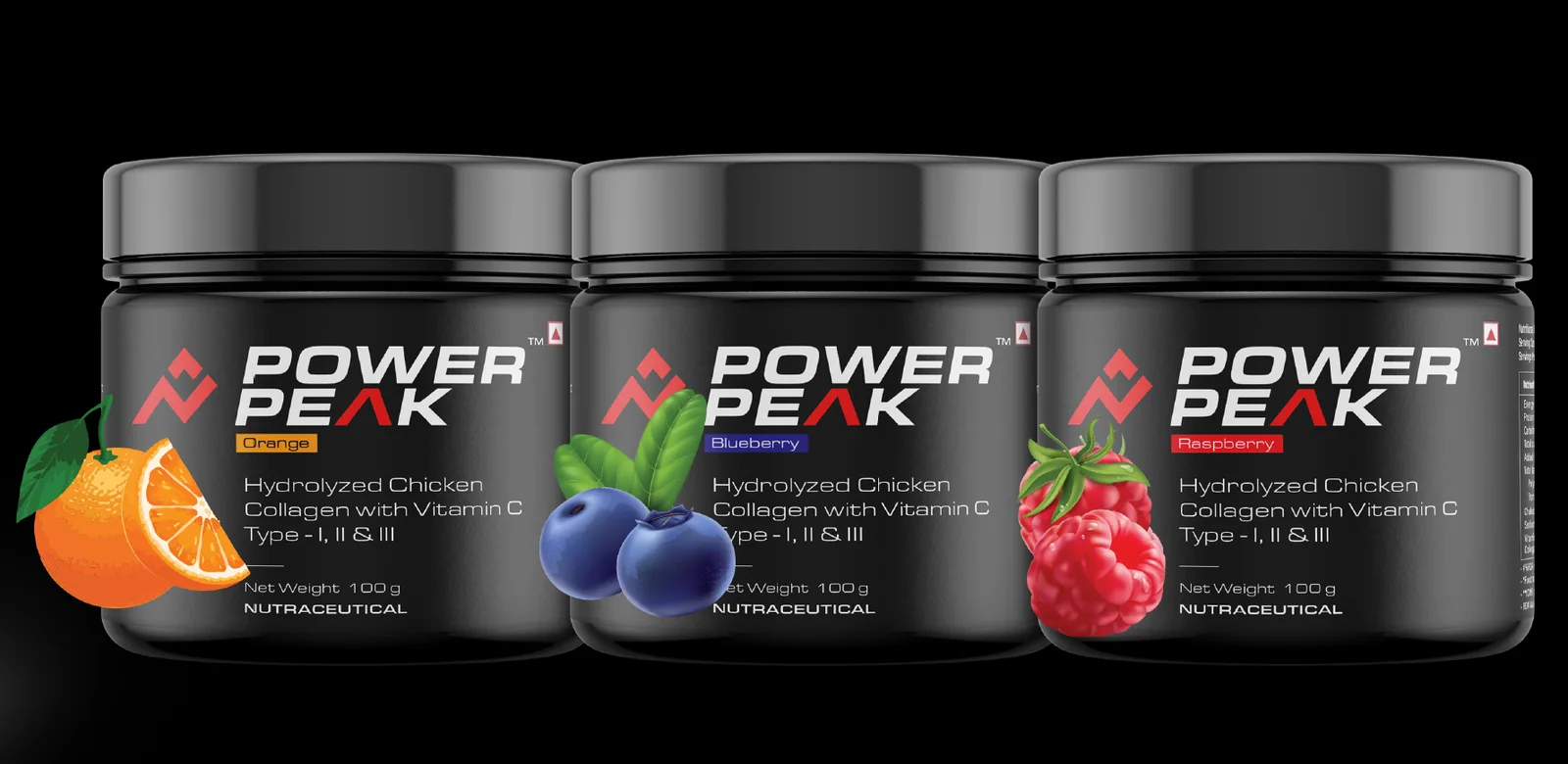
The jar packaging uses a matte black container with a clear typographic hierarchy: brand name, flavour, product description, net weight and the nutraceutical tag. Each flavour has its own colour tag, so customers recognise the variant at a glance.
We designed Lemon, Orange, Blueberry and Raspberry variants with realistic fruit illustrations, plus the back panel with ingredients, nutrition table, dosage, usage and storage information including the FSSAI mark.
One look from Instagram to the website
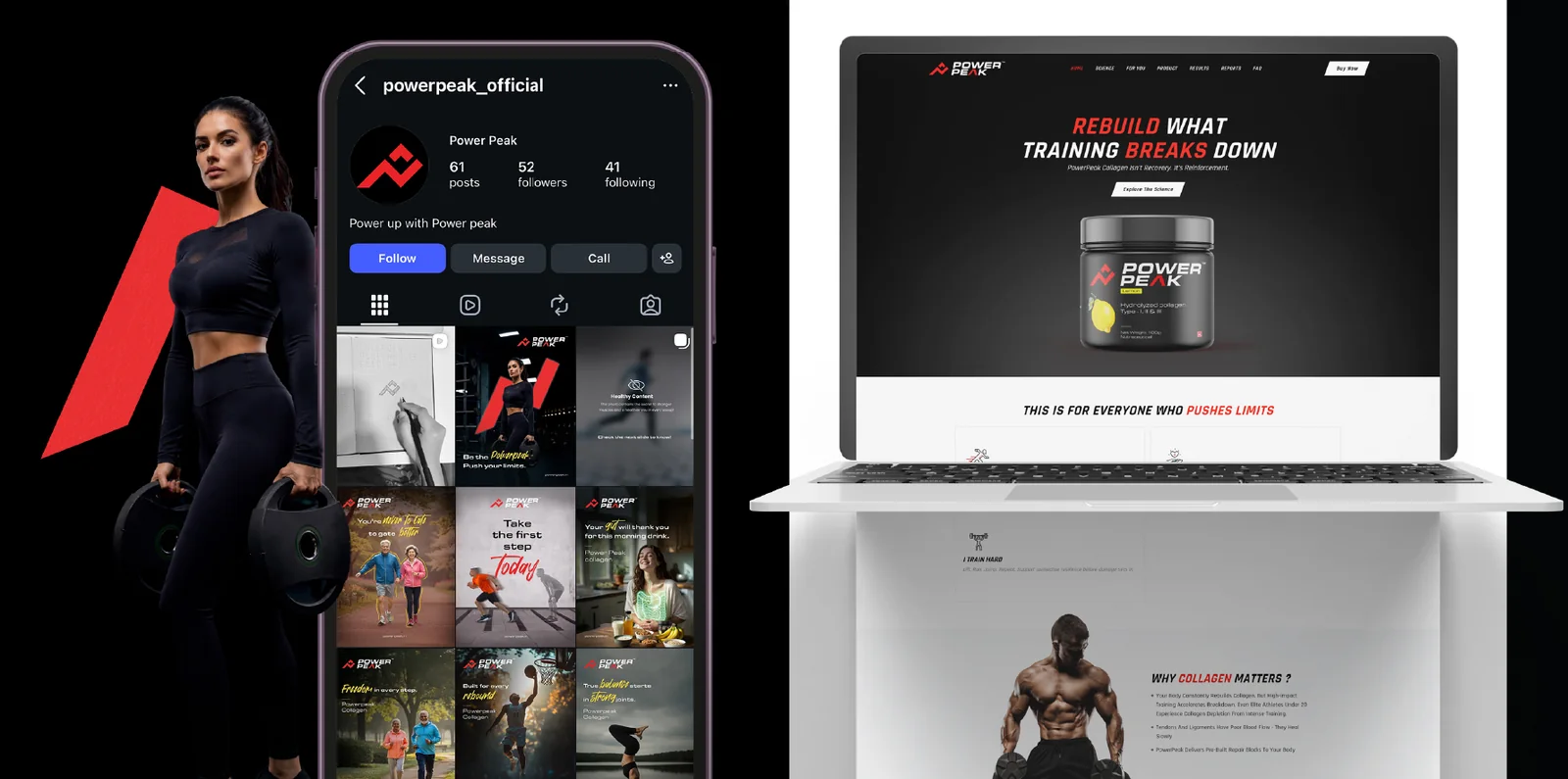
The Power Peak website uses a dark, high-contrast layout with the product front and centre and a clear call to action. Headlines like "Rebuild what training breaks down" speak directly to the athlete.
On Instagram we designed a feed that mixes motivation, lifestyle and product education. Because the layout, type and colours stay consistent, the profile looks like one brand rather than a collection of posts.
Listing images that sell on a small screen
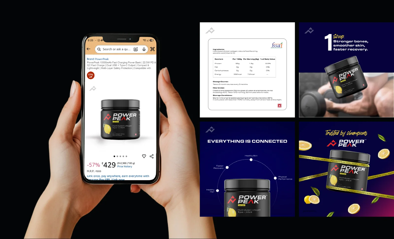
For marketplace selling we designed Amazon listing creatives and social ads: benefit-led infographics, a nutrition and usage panel, and campaign-style images with the product at the centre.
Clear messages such as "1 scoop: stronger bones, smoother skin, faster recovery" help shoppers understand the product in seconds, which supports click-through and conversion on mobile.
One brand, every touchpoint
From the first pencil sketch to the Amazon listing, Power Peak now looks like one confident brand. The logo, colours, typography, photography style and tone of voice are consistent, so a customer who sees the Instagram post, the website and the jar immediately knows they belong together.
This is how we work at The Shades: we do not just design a logo and hand it over. We build the whole brand system and extend it across the formats that matter for sales.
Related services: brand identity and logo design, product packaging design, website design and Amazon listing creatives.
Questions about this project
What did The Shades create for Power Peak?
What does the Power Peak logo mean?
Can you design packaging for a supplement or nutraceutical brand?
Do you also design Amazon listings and websites for brands you brand?
Want a brand story like Power Peak?
Tell us what you are building. We reply the same working day with ideas, a timeline and a clear quote.